CD Front Cover

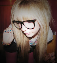
This is the front cover of my CD. I took the picture myself and edited it by using photoshop.
The black and white gives it that serious look but the bright colours make it fun aswell. Also the light effect i have added to the photo puts the girl into a spotlight, which makes her stand out.
The graffiti tect also gives it that fun look i wannted to give it but not in bright colours as wanted to give it still a serious look.
Creating the front cover
I firstly started off with a blank canvas like this with dimensions of 12cm x 12cm .

I then opened the photo i took into photoshop selected the marquee tool and selceted the part of the picture i wanted. After that i copied the image Ctrl C.
I pasted the copied image into the blank canvas.

I then position the image to fit the canvas. Notice that there is a gap, adn wanted more brick work to cover the whole of the cover.

So i went back to my original image, cut out the piece i needed to add, copy and paste into my front cover design.

Pasted into the canvas.

I moved the new layer to fit the gap. I liked how this worked as it fits in really well and you cant tell that it is on a other layer as it blends in with the original picture.

I then merged the two images together so then when i go to add effects it won't look odd and make them so they look like two different images. So it then became one image.

I wanted to make the image black and white to give it that serious look. So went to image -> adjustments -> Hue/Saturation.

New window open so that could change and add Hue or Saturation to it and change the lighteness of the effects.

The thought about adding light effect to the image so that the girl would stand out and give it a more of a darker look to it. I really like this effect as it make it look more of a proffessional look to it aswell as the darkness.

After that i wanted to start adding my text to it, as the image it self looked good enough and didnt want it to look too busy, just to keep it simple looking. To get the text i wanted i went to a website call dafont.com which i can choose from a wide selection of fonts. I chose this font as it looks fun and playful, and it would look good on the cover.

Again i copied and paste the text as a new layer onto my image. I resized it to make it larger so it is visable to see and also remove the white background with the magic eraser.

I then did the same for my other piece of text with a different font which i liked. I used a different font to add to the playful ness of it.
Ater that i wanted to add some colour so that the cover didn't look too serious or a bit dull with what i want the music to be like. I added two colours bight pink and green as they stand out with eachother. I scribbled them using a new layer behind the text. This really makes the text stand out more and gives a rebel look aswell.
I also added two explamation marks ; one which is turned upside down and another the normal way up this also adds to the rebellious and playful look i wanted to create against the seriousness of the image.
Also added an advisory label onto the front of the frontcover. This also adds to the rebellious look and warns that there is strong language. So this also gives a hint to what sort of style of music it is and that it isn't anything that is soft and anyone that dosnt agree to strong language then they are warned that there is some sort of content to it.
The outcome of the front cover i really like as it appeals to me and possibly to the target audience. The concept of the whole cover works really well, everything contrasts with eachother, nothing looks odd or out of place. If i was to see this on a shelf in a shop i'd get the idea its possibley rock with a girly fun twist to it and a bit rebellious, but the black and white says that there serious about the music they make and it means something to them.
CD Back Cover

For my back cover i wanted to keep the house style similar with the colours and text so that both cover don't look so odd with each other. Also add the same sort of effects so there is a constand housestyle going on. I like the way i have made this, as i didnt want to put the attention on the girl but on the song list and this works real well. i really like the layout of the image as this is what i wanted it to look like.
Creating the Back Cover

Like my front cover i started with a blank canvas to start on. And opened the image i wanted to use.

I then selected the image by using the marquee tool with the section i wanted to copy onto my blank canvas, and copied and paste it to that.

Pasted into the blank canvas as a new layer, i moved the layer to were i wanted it and left a gap at the top to fill.

So to fill the gap i went back to the original image and selcted a piece fron that a copied into my other canvas.

Then placed the copied piece to fit the gap and blend in with the photo which works well and i like it with the way you cant tell that there seperate layers and that there was a gap.

I then merged those two layers together to make a new image so when it comes to actually editing colours it won't make them look odd and make it easier.

To keep to the same sort of housestyle to the front cover i changed the colour of the image to black and white using the saturation/hue channel to change it, also darkened the image a bit to math with the front cover.

To keep to the housestyle i added the light effects that i did on the front cover. This time it isn't on the girl but on one of the bins on the far left. I placed it there because i wasnted the attention to go on were i wanted to place the song names . But you can still see the girl. And the layout of the image is perfect for this aswell, which is what i like about it.

Again i used dafont.com to get my text and i used the same text from the front cover as it flows with the theme.

Print screened the text from the website placed in a new canvas then selected the text and copied and past onto my back cover. I then removed the white background as it didn't look that good. Although the text isn't clear, black on black.

I then added the two colours from the front bright pink and purple and like the front cover, made a new layer put behind the text and scribbled the colour behind, so then the text was more readable, and also made it stand out more. Continuing with the playfulness.
I also added a bar code to the bottom right to make it more proffessional like.

I also added a copyright logo and small print similar to everyday cd's with copyright ect mentioned and also a website to visit. This also makes it look proffessionl and more like a real CD. Also i'v placed it down the right side of the image, as this fills the blank space between the girl and the edge of the photo, which i think works good aswell.
Creating the Back Cover


I also added a bar code to the bottom right to make it more proffessional like.


After that i looked back at the cover and changed a few postionings of the barcode and small print. The Barcode was hugging the bottom of the image, so i free transformed the small print and moved it more up to make space at the bottom. I then moved the Barcode to the right so its more clear. I like it better this way as everything isn't so cramed.
Overall i like the whole concept of the backcover because its well layed out and flows with the front cover.It has a professional touch to it with labels and such. The images are appriate with the look i wanted to create.
Completed covers


0 comments:
Leave a Comment